Lessons Learned from a Small Web Redesign
April, 16 2013
by Nathanael Yellis

In 2013, I managed online operations for Heritage Action. The year before, in 2012, we launched the Sentinel Program for their conservative activists. Sentinel had been a resounding success, but the first version of the Sentinel website was difficult to find and to use.
We identified lessons learned from the bad version and the redesign resulted to a doubling of pages per session and time on site.
We worked with designer Michael Garvey to rethink how the pages should be laid out. He did a great job of matching the design to the needs of our Sentinels.
The project had strong visual and behavioral results because we started with the needs of the customer, conservative activists participating in the Sentinel Program.
Design: Before & After
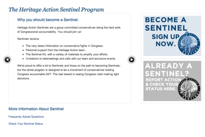
The old homepage held a lot of marketing copy about the program and a static call to action:
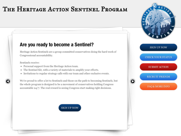
The new design added a simple navigation bar along the right side, and calls to action within short form copy in the main area:
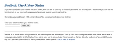
The old status check page was heavy on copy and lacked a strong visual cue of what the page is for:
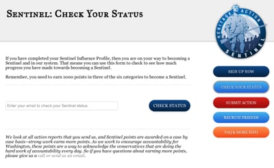
The new status check page carried the /sentinel navigation bar and has a strong visual call to action:
Development: Adding Helpful Features
Our talented web developer Andre Fredette implemented the new designs.
Andre also helped me think through what features would help Sentinels use the pages more easily, for example a cookie that remembers a Sentinel's email address, which is used to check status and submit activity.
We also added a "welcome back" banner for returning users, directing them to the right pages.
Redesign Results
After adding navigation, clear design, and new tools, visits to heritageaction.com that included /sentinel saw double the pages per visit and more than double the time on site. The more useful pages were used more.
Web design lessons learned:
- Start with the core need: what are people visiting this page to do?
- Think about the journey: once people are here, where will they want to go next?
- Reduce friction: usability is all about finding and removing the small barriers and papercuts.


